Monthly Tabs—Vermont Style
Every summer, my family and I
go to Vermont for a week’s long vacation and family reunion. This year was no exception.
While there this year, I looked around for something that I
could use to beef up my planner inserts.
Stickers—maybe, but finding Vermont stickers was not going to be
easy. Inserts—no I would never find
those. Pictures—sure, those I could find
very easily. But how incorporate those into
my compact
binders
without making them too bulky (like last
time) would be the hard part. But I happened
upon a little something that I knew would be great for my purposes.
I found a small wall calendar featuring scenes from Vermont.
It’s your basic wall calendar—it opens up like a flip
calendar. On the top is a picture, and
on the bottom is a monthly calendar grid.
Flip the page up again, there’s the next month. And so on.
The last thing I need is another calendar. I don’t typically use wall calendars, but
this paper was thin enough that I knew I could use the pictures for my
planner. And since they came from a
monthly calendar, I figured I could use each month’s picture for my
corresponding monthly
tabs. So here’s what I did:
First I got my supplies together.
This includes the calendar (obviously), a transparent fly
leaf that I was willing to cut the punched holes from, and paper clips.
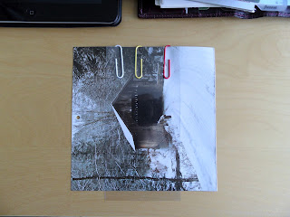
Next, I took out the first calendar photo, lined up the fly
leaf over the part of the picture I wanted, paper clipped the fly leaf so that
it would stay in place, and traced around the edges of the fly leaf.
This allowed me to know exactly where to cut the photo.
Then, using my paper cutter, I cut along the lines.
I then had my finished product.
I used scrapbooking tape (sticky on both sides and made for
heavy-ish paper) to adhere the photo to my tab.
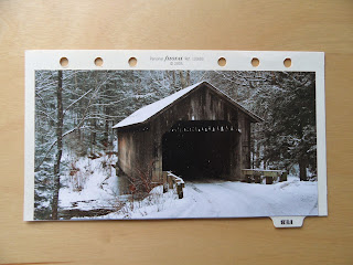
Here is the finished product:
I cut the photo large enough so that it would take up a
majority of the tab but leave the punched holes exposed. I didn’t want to have to punch the photo once
it was on the tab because if I made the pre-punched holes in the tabs bigger, I
figured that would allow for more ripping and tearing of the holes, and I didn’t
want that. I could have punched holes in
the photo and then pasted it onto the tab, but I’m too OCD for that—if the
holes didn’t line up exactly right, I
would have been annoyed. Plus, I don’t
have the patience for being that finicky.
But this works well for me. I don’t
love seeing the background of the tabs, but seeing as the calendar wasn’t as
wide as the tabs themselves anyway, there would have been some exposure either
way. So I decided I would have to get
over that.
I repeated the above steps for the remaining calendar
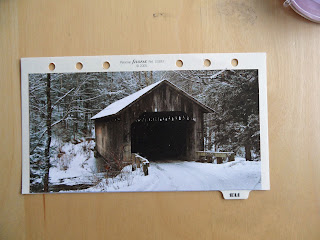
photos. Here is the finished product:
For anyone who might want to see each monthly tab
individually, here they are:
 |
| January |
 |
| February |
 |
| March |
 |
| April |
 |
| May |
 |
| June |
 |
| July |
 |
| August |
 |
| September |
 |
| October |
 |
| November |
 |
| December |
What I love about these monthly tabs is that they correspond
very nicely with my Vermont
postcards that I rotate at the front of my binder.
My next project is to do something similar for my section
tabs. If I can find some cute,
non-girly stickers, I might just use them to decorate the tabs. Otherwise, when I’m there next year, I might
look for a calendar with different pictures and use them. I love having scenes from Vermont in my
binder for two reasons: one, it makes the binder personally mine and reflects
who I am, and two, it allows me to visit my favorite place mentally when I can’t
be there physically.
We shall see what progresses there…


wow, gorgeous pictures! so soothing.
ReplyDeleteThanks! That's why I want the pictures in my binder, so that I can easily be transported to a calmer place. :)
DeleteThose are so nice! I would totally do that if my monthly tabs didn't have valuable writing space on each one!
ReplyDeleteThanks, J! I agree with you - you need that writing space, especially now. :) I use a sticky hot sheet on the reverse of the monthly tabs to keep a list of things that need to be done that month. For now, that's sufficient. Next up: the section divider tabs!
DeleteThey look wonderful!! I might just steal this idea!
ReplyDeleteThanks, Sheila! Please do! That's why we all share our ideas, so that others can copy, er, I mean, borrow. :)
DeleteFabulous!!! I want to go to Vermont now :o)
ReplyDeleteThanks! I highly recommend visiting Vermont if you're ever in the area. =)
DeleteWow, what a great idea!
ReplyDeleteThanks Bryan! I'm going to look into something similar for my tabbed sections, stickers maybe, although I prefer the actual photos. We'll see what I can find.
DeleteGORGEOUS!!! I'm envious. Great job! Now I'm going to steal this idea.
ReplyDeleteThank you! Feel free to steal away. :)
Delete